


You get only 2 seconds to convince your visitors about your relevance. If you fail, the visitor clicks the back button and leave your site for good. Here’s how you can stop it.


This post is in response to a question I’d asked in StudioPress forum. You might want to visit the page to see my point of view. I was able to find the answer to my own question and this is the reason why I’m writing this post.
If you’re optimizing your website for mobile devices, one of the first things you should be looking at is the typography. Although, many responsive themes are designed to render resize their fonts as per the different screen sizes on handheld devices, sometimes, you may need to apply CSS tweaks in the media queries to let the heading tags resize as per the screen sizes.
Speaking of my personal experience, many WordPress themes don’t really address this aspect quite well. Therefore, if you’re going to use a responsive theme out of the box, the headings are likely to remain intact regardless of the screen size of the mobile device you’re using. While this may not be an issue to you, it can be an issue from a reader’s standpoint especially if you consider the real estate of small screen devices.
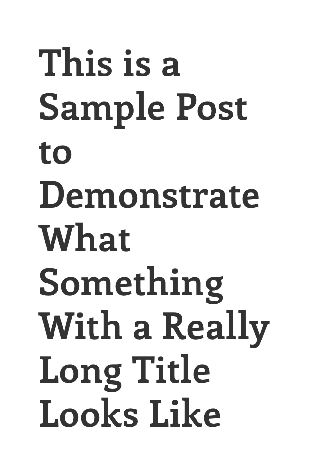
I have seen many themes where a standard H2 is 36 px and it doesn’t resize even when you view it on mobile device. As a result, it looks too big on relatively smaller screens such as mobile phones.
Take a look at the following screenshot:
How to Fix This Issue
There are many different approaches to making the headings responsive on mobile devices. However, I prefer doing it via Media Queries.
If you’re using a Genesis Theme, add the following code snippet in under the Media Queries.
@media only screen and (max-width: 480px)
.page .content .entry-title, .single .content .entry-title {
font-size: 24px;
}
Note: You might want to add the same code snippet under different breakpoints and tweak the font size as per your choice.
Before tweaking your headings, you want to see how they appear in different screen sizes. For this purpose, you can use the Responsive Design Tester by Nuts&Bolts Media and see how the headings appear on different mobile devices.
If you’re using the Chrome browser on your desktop PC, you should be able to use the inspect elements and make changes to see how it looks on a certain device.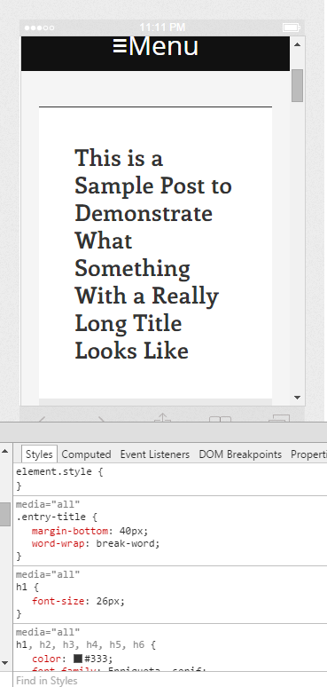
Once you find the right measurement for your headings, you can go to the CSS file and add the above code snippet under the media queries.
That’s it! Now, you should see responsive headings in mobile devices.
Hope you find this post useful.