Ecommerce website mistakes to avoid
Six ecommerce mistakes that cost small online shops sales: weak product pages, slow mobile pages, poor support, clumsy checkout and unmonitored payments.
Read article →
A landing page has one job: get the visitor to take one action. These are the elements that matter, and the common mistakes that cost you enquiries.
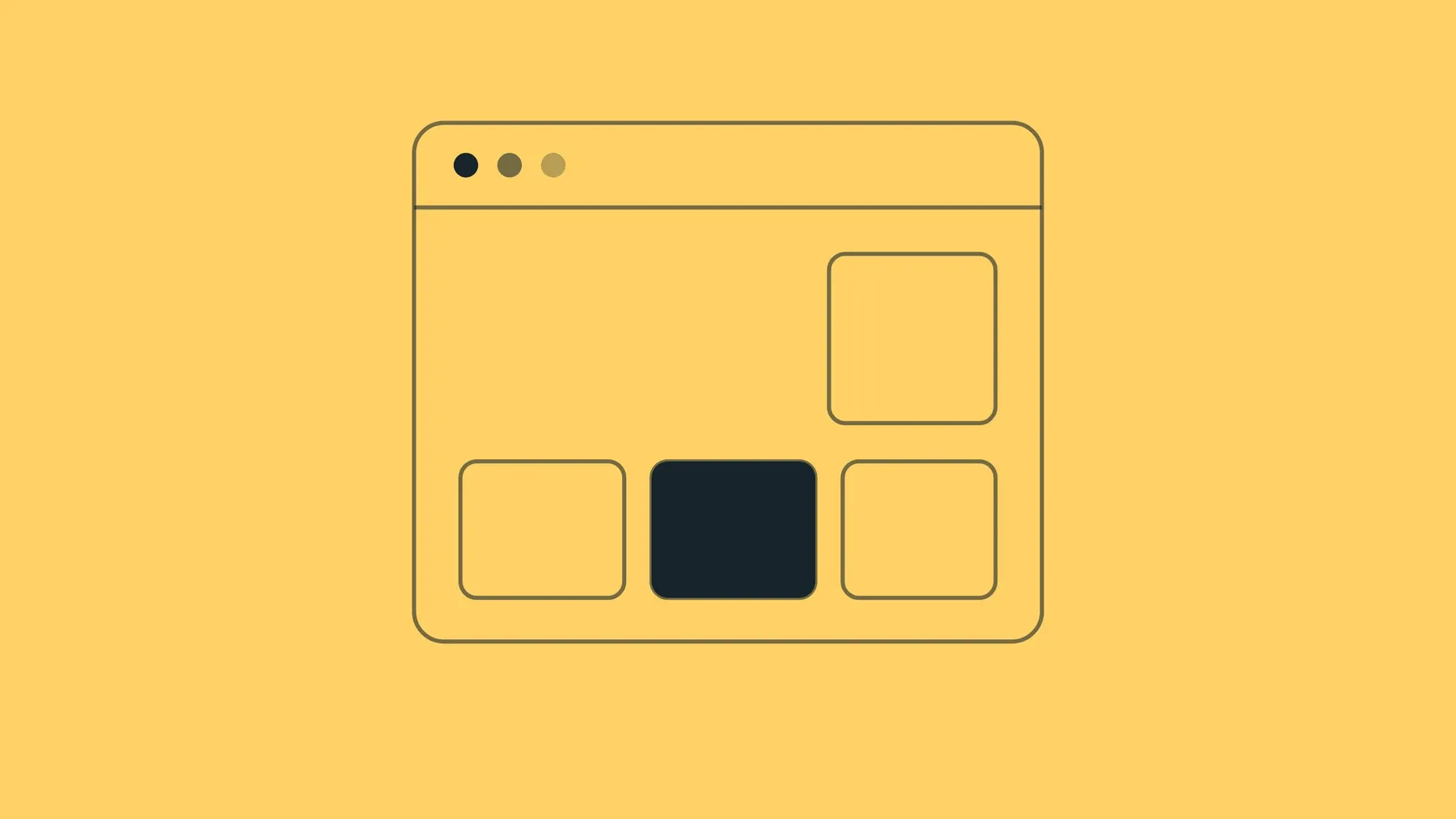
A landing page is the page a visitor arrives on after clicking an advert, a search result or an email link. Unlike a home page, it is built around a single action: request a quote, book a call, download a guide or buy a product.
If you pay for clicks and few visitors act, the problem is usually the page, not the traffic. Think of the visitor as someone who has just arrived at your shop door with a specific expectation. Everything on the page should confirm they are in the right place and make the next step easy.
The headline is the first thing people read. It should repeat the promise that brought them there. If your advert says “Office desks under Rs 15,000”, the page should open with that, not a general “Welcome to our furniture store”. A mismatch makes visitors doubt they clicked the right thing, and they leave.
Beneath the headline, a short secondary line can address the reader’s real concern. For a desk seller it might be “Sturdy desks for small offices that do not stretch the budget”. Say what you do, who it is for and why it helps, in plain words.
A landing page is a trust-sensitive page. The visitor does not know you yet, and spelling or grammar mistakes make them wonder what else is careless. Read the page aloud, have someone else proofread it, and keep sentences short. Specific details beat vague claims: say “delivery in three working days” if that is true, not “fast delivery”.
Testimonials, ratings, client logos, certifications, years in business and secure payment badges reduce doubt. Use only real ones, and attach a name and detail where the customer agrees. A short, specific testimonial (“Installed in a day and the team cleaned up after”) works better than “Great service!”. Never invent or exaggerate social proof.
Tell people exactly what to do next, using a verb: “Get a free quote”, “Book a demo”, “Download the checklist”. Say what happens after the click if it is not obvious. Avoid vague labels such as “Submit”. If the page has a form, ask only for what you need. Every extra field loses some people.
The call-to-action button should be easy to spot. Use a colour that contrasts with the background and the rest of the page, with enough size and spacing to tap comfortably on a phone. A bright button that blends into a bright banner does not help.
Remove anything that distracts from the goal. A full navigation menu, a sidebar and many outbound links give visitors reasons to wander. Many landing pages have a logo and one action only. Repeat the same call to action at sensible points down a longer page rather than offering different ones.
Show the product or service in use, or the outcome. A short video or a clear set of photos can explain more than a paragraph. Use your own photos where you can, and keep files small so the page loads fast. Add alt text for accessibility.
Keep the headline, the main benefit and the call to action visible when the page first loads, on both desktop and phone. This does not mean packing everything in. Visitors do scroll, but they decide quickly whether to stay.
Even a good page loses people when the basics are missing.
Test on a real phone as well as a laptop; most visitors are likely to use phones. Make sure the page loads quickly and the form actually works. Then track how many visitors take the action, change one thing at a time, and compare. Rules of thumb are a starting point; your audience will tell you what works.
Our guide to e-commerce website mistakes covers related problems for online shops, and copywriting cliches explains which phrases to avoid in your headlines.
If you want a landing page designed and built to these principles on a fast WordPress site, see our website development service, or contact us to talk through your goal.
Six ecommerce mistakes that cost small online shops sales: weak product pages, slow mobile pages, poor support, clumsy checkout and unmonitored payments.
A good 404 page helps lost visitors find what they wanted. Learn what to include, what to avoid, and how to build one in WordPress, including block themes.
Part 3 of our beginner series: what a CMS is, how WordPress, Drupal and Joomla compare, and why most small businesses start with WordPress.
Part 2 of our beginner series: what web hosting is, the types available, and the support, backup, speed and exit questions to ask before you sign up.
No giant proposal. No unnecessary package. Start with the business, the goal and the budget. We'll work out the digital plan from there.